What a High-Converting Checkout Looks Like (And What to Avoid)

What a High-Converting Checkout Looks Like (And What to Avoid)
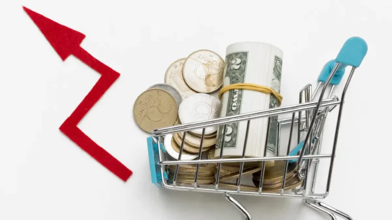
Checkout is where money is either made or abandoned. Small mistakes here are expensive.
1. Remove Unnecessary Friction
- Keep fields to the minimum required:
- Name, phone, email, address, PIN.
- Offer guest checkout with option to create an account later.
- Pre-fill where possible for returning customers.
2. Show the Full Cost Upfront
Before “Place Order”, clearly display:
- Product total
- Taxes
- Shipping charges
- COD fees (if any)
- Final payable amount
No surprise = higher trust = fewer drops.
3. Offer Relevant Payment Options
For Indian buyers:
- UPI is non-negotiable.
- Cards, netbanking as standard.
- COD where it makes sense based on your rules.
Ensure they’re presented cleanly—not in a cluttered wall of logos.
4. Design for Small Screens
- Single-column layout works best.
- Sticky order summary or total.
- Large, clear CTA buttons.
- No tiny form fields squeezed into two columns.
5. Build Trust Within the Checkout
Subtle cues:
- HTTPS lock and secure-message near payment.
- Short line: “Easy returns as per policy” linking to your page.
- Visible support contact (email/phone/WhatsApp).Easy returns as per policy” linking to your page.
6. 5 Common Checkout Killers to Avoid
Subtle cues:
- Forced sign-up before checkout.
- Coupon box dominating the page, sending users to hunt discounts.
- Pop-ups appearing during payment.
- Slow-loading scripts.
- Over-complicated address forms.
7. Why a Standardized, Managed Checkout Helps
They are not galleries for art. They are tools to find products quickly.
- You tweak rules (COD, shipping, etc.) without breaking UX.
- Testing and improvements are consistent.