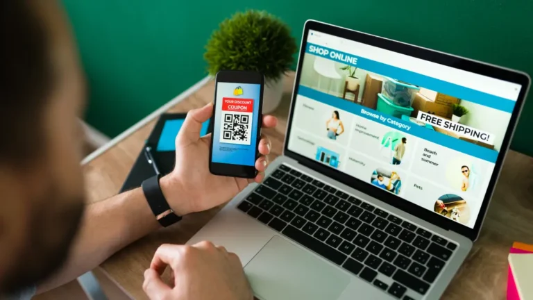
Homepage, Categories, Product Pages – What Actually Matters for Conversions
Homepage, Categories, Product Pages: What Actually Matters for Conversions
Many brands over-design and under-explain. Let’s keep it simple.
1. Homepage: Clarity in 5 Seconds
A high-performing homepage answers:
- What do you sell?
- Who is it for?
- Why should I trust you?
Key blocks:
- Hero with clear value (no vague slogans)
- 3–6 primary categories
- Bestsellers / new arrivals
- 2–3 trust elements:
- Reviews, secure payment note, shipping/return highlights
- Clear CTAs: “Shop now”, “Explore [Category]”
Avoid heavy sliders, auto-play, and 10+ banners.
2. Category Pages: Let People Filter Fast
Good category pages:
- Show a neat grid of products above the fold.
- Offer visible filters:
- Size, color, price, type, etc.
- Let users sort logically (relevance, price, newest).
They are not galleries for art. They are tools to find products quickly.
3. Product Pages: Decision Pages, Not Catalog Dumps
Must-haves:
- Strong, specific title
- Clear price + any offer
- Quality photos
- Benefits bullets
- Key details (size, ingredients, material, etc.)
- Delivery info (estimated) & policy snippet
- Prominent Add-to-Cart / Buy buttons
Optional but powerful:
- Reviews
- “You may also like”
4. Keep It Mobile-First
On smaller screens:
- Key info and CTA should appear without endless scrolling.
- Images should load fast.
- Menus and filters must be thumb-friendly.
5. Use a Proven Base, Then Brand It
Instead of reinventing layouts:
- Start from a flow that’s already aligned to best practices.
- Customize branding, content, and emphasis—not the fundamentals.
That’s the philosophy behind the way ShopSwift structures storefronts.